Your home is one of the most important aspects of your life, so it is no surprise that people want the aesthetic of their home to reflect their personal style. Choosing the right color palette perfectly brings together different areas of the home and creates a cohesive look. This blog will give you some tips on how to use color theory to choose a palette for your home.
Understanding Color Theory Basics

Color theory is the study of how colors interact with each other and the visual effects of specific color combinations. It involves principles such as the color wheel, color harmonies, and the psychological impact of colors to help create balanced and aesthetically pleasing designs.
The foundation of color theory starts with primary colors: red, blue, and yellow, which cannot be created by mixing other colors. From these, secondary colors are formed by combining two primary colors: green, orange, and purple. Tertiary colors result from mixing primary colors and secondary colors, such as red-orange or blue-green.
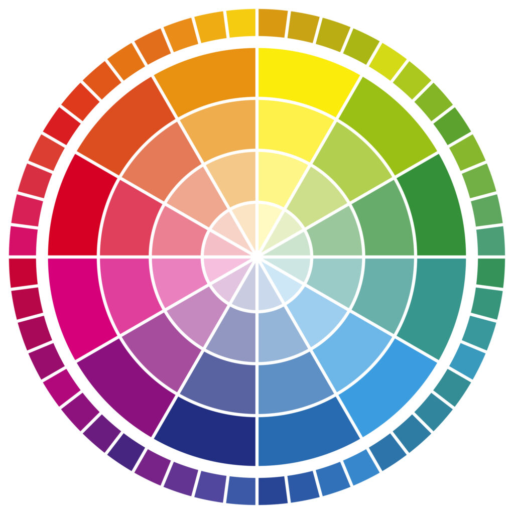
The color wheel, a circular diagram of colors, visually represents these relationships, helping to identify complementary colors, analogous, and triadic color schemes.
Understanding warm and cool colors is also crucial. Warm colors, like reds, oranges, and yellows, evoke energy and warmth, making spaces feel cozier. Cool colors, such as blues, greens, and purples, evoke calm and relaxation, often making rooms feel more spacious. Balancing warm and cool tones can create a cohesive and inviting atmosphere.
Color Harmonies

Complementary Colors
Complementary colors are pairs of colors located directly opposite each other on the color wheel, such as red and green, blue and orange, or yellow and purple. These combinations create a high contrast, vibrant look that can make elements stand out. In home decor, complementary colors can be used to highlight features and create visual interest. For example, a blue sofa with orange throw pillows, or a green accent wall with red artwork. Balance is key—use one color as the dominant hue and its complement for accents to avoid overwhelming the space.
Analogous Colors
Analogous colors are groups of colors that are adjacent to each other on the color wheel, such as blue, blue-green, and green. These hues create a harmonious and soothing palette that is perfect for achieving a unified look in home decor. You can incorporate analogous colors by selecting one dominant hue and using its neighboring shades for accents and highlights. For instance, pair shades of blue with teal and turquoise for a serene and cohesive bedroom design. To add depth, incorporate varying shades and tones within the analogous color scheme, creating visual interest while maintaining harmony.
Triadic Colors
Triadic colors are sets of three colors evenly spaced around the color wheel, forming a triangle, such as red, blue, and yellow or orange, green, and purple. These combinations create a dynamic and vibrant palette that adds energy and visual interest to home decor. When using triadic colors, ensure balance by selecting one dominant color and using the other two as accents. For example, in a living room, paint the walls a shade of red while incorporating blue and yellow accents through pillows, artwork, or rugs for a lively and harmonious space.
Monochromatic Colors
Monochromatic colors utilize variations of a single hue by adjusting its saturation, brightness, or tint. For instance, different shades of blue ranging from light sky to deep navy. This approach creates a cohesive and sophisticated aesthetic while allowing for depth and interest within a space.
Different textures, patterns, and materials can be incorporated to add visual interest without introducing other colors. In a monochromatic kitchen, for example, combine light blue cabinets with a darker blue backsplash and countertops, and add texture with brushed metal hardware and accessories for a cohesive and dynamic look.
Psychological Effects of Colors
Here are some of the psychological effects of colors to consider when designing your home:
-
- Red: Energy and passion
-
- Blue: Calmness and serenity
-
- Yellow: Happiness and warmth
-
- Green: Nature and tranquility
-
- Purple: Luxury and creativity
Tips for Choosing the Right Palette

When you select a color palette for your home, you should consider factors like natural light and room size to ensure the chosen colors complement the space. Existing furniture and decor should be evaluated to harmonize with the new palette seamlessly. You can also experiment with paint samples and swatches to see how colors appear in different lighting conditions.
Lastly, avoid common mistakes like selecting colors based on trends or ignoring the overall mood and functionality of the space. Balancing these considerations ensures a cohesive and visually pleasing home design.
Choose Medias Painting LLC
At Medias Painting LLC, we are experts at painting the interior of homes. We are highly skilled and experienced at our craft, and we can get your home looking amazing. We know the importance of incorporating color theory within a home, and we are ready to bring your vision to life. Contact us to get a free quote today.


