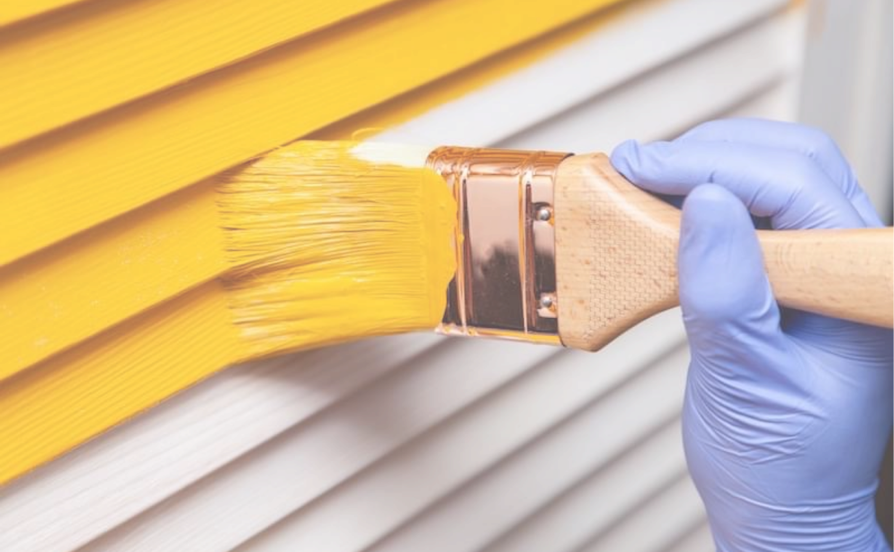
Painting Services

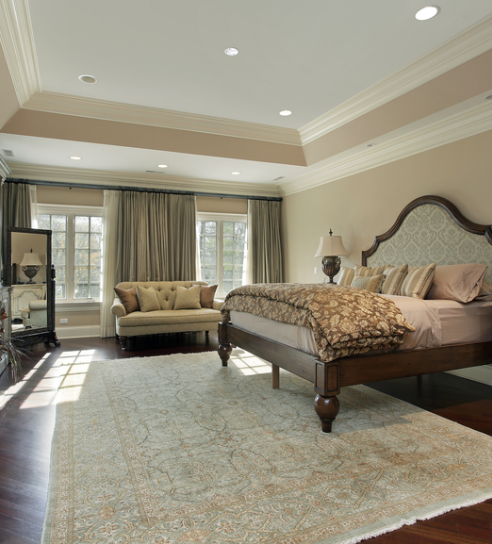
Painting

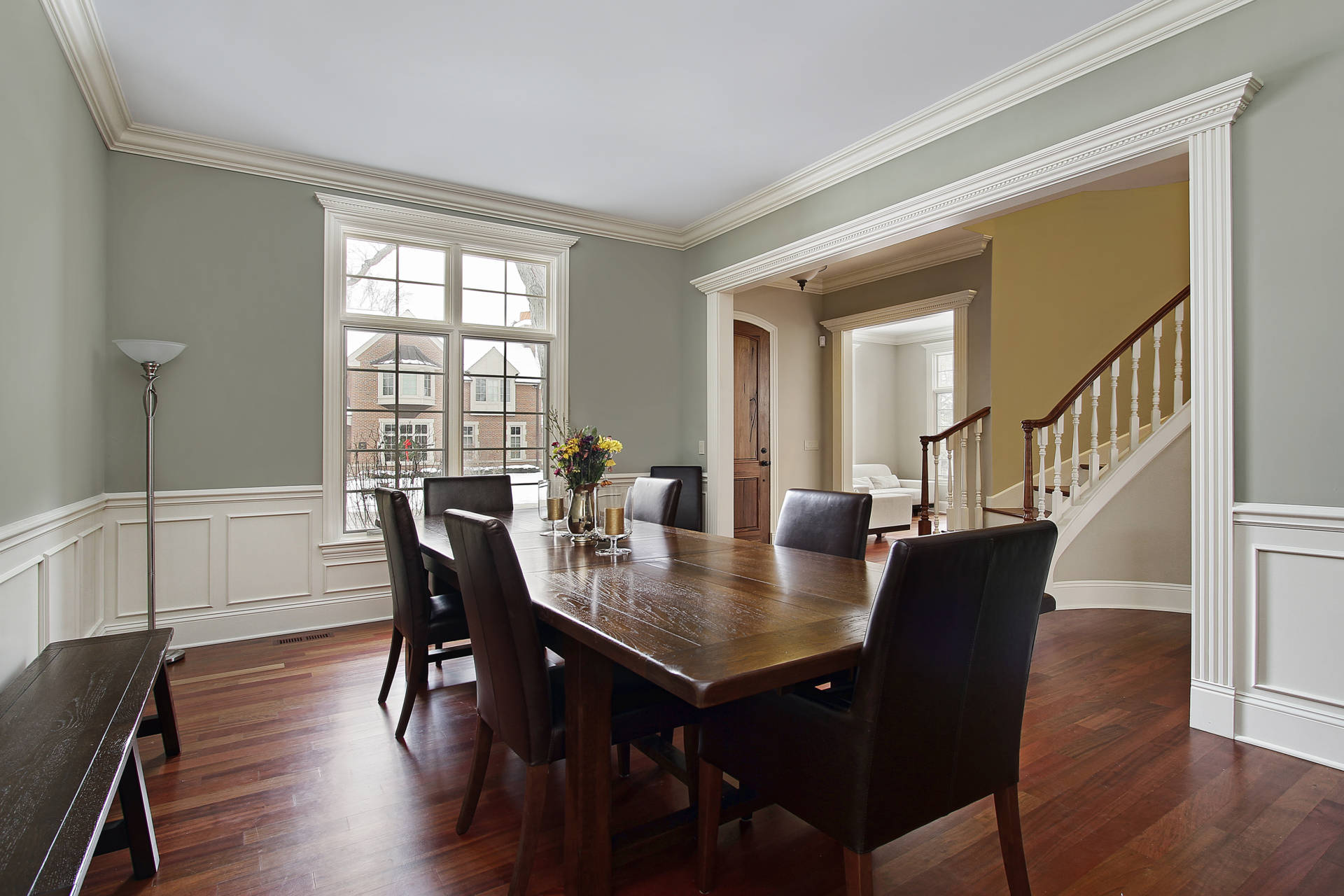
COMMERCIAL PAINTING

STAINING

EPOXY FLOORS

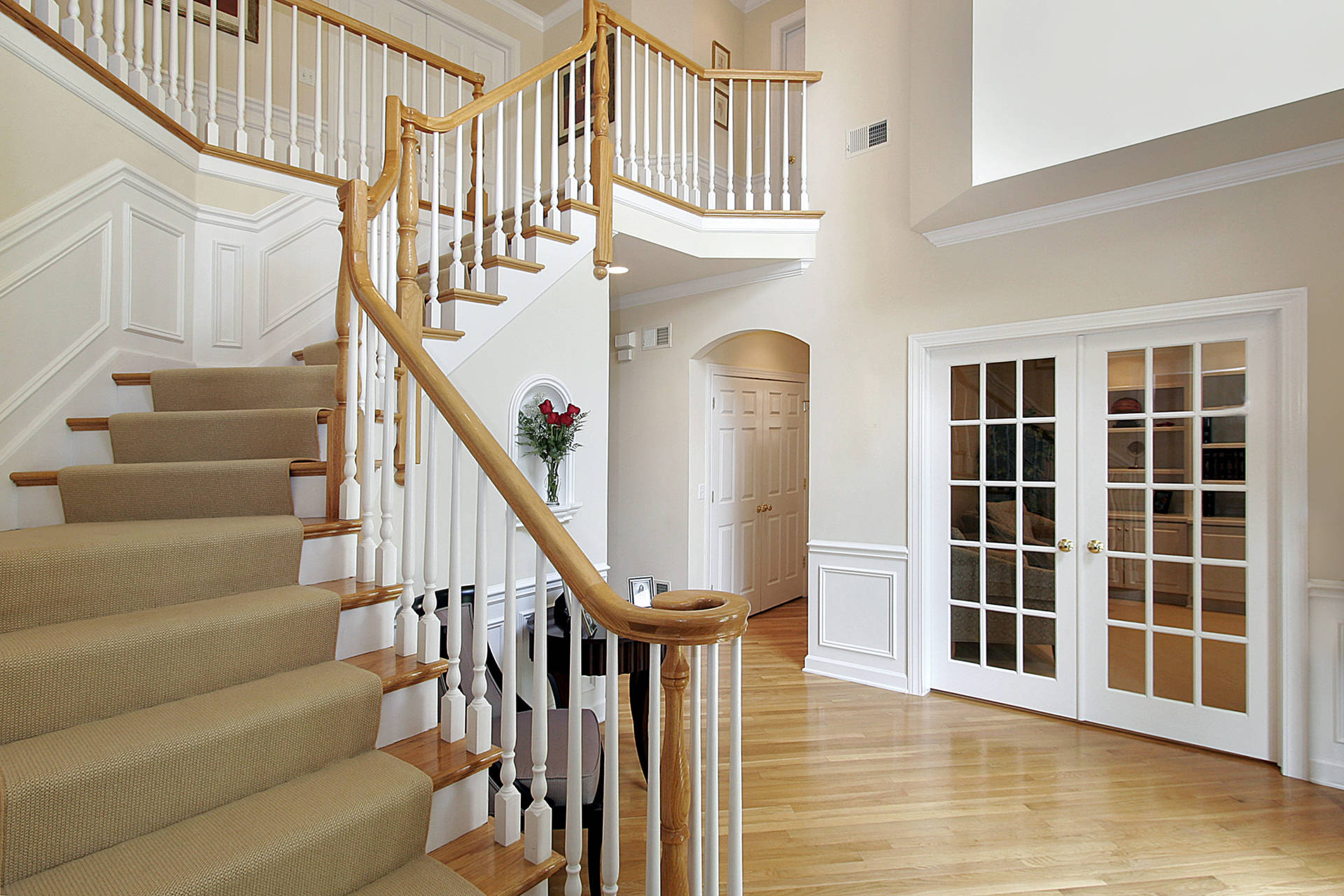
CARPENTRY

CABINET PAINTING

POWER WASHING
Painting
WE LOVE
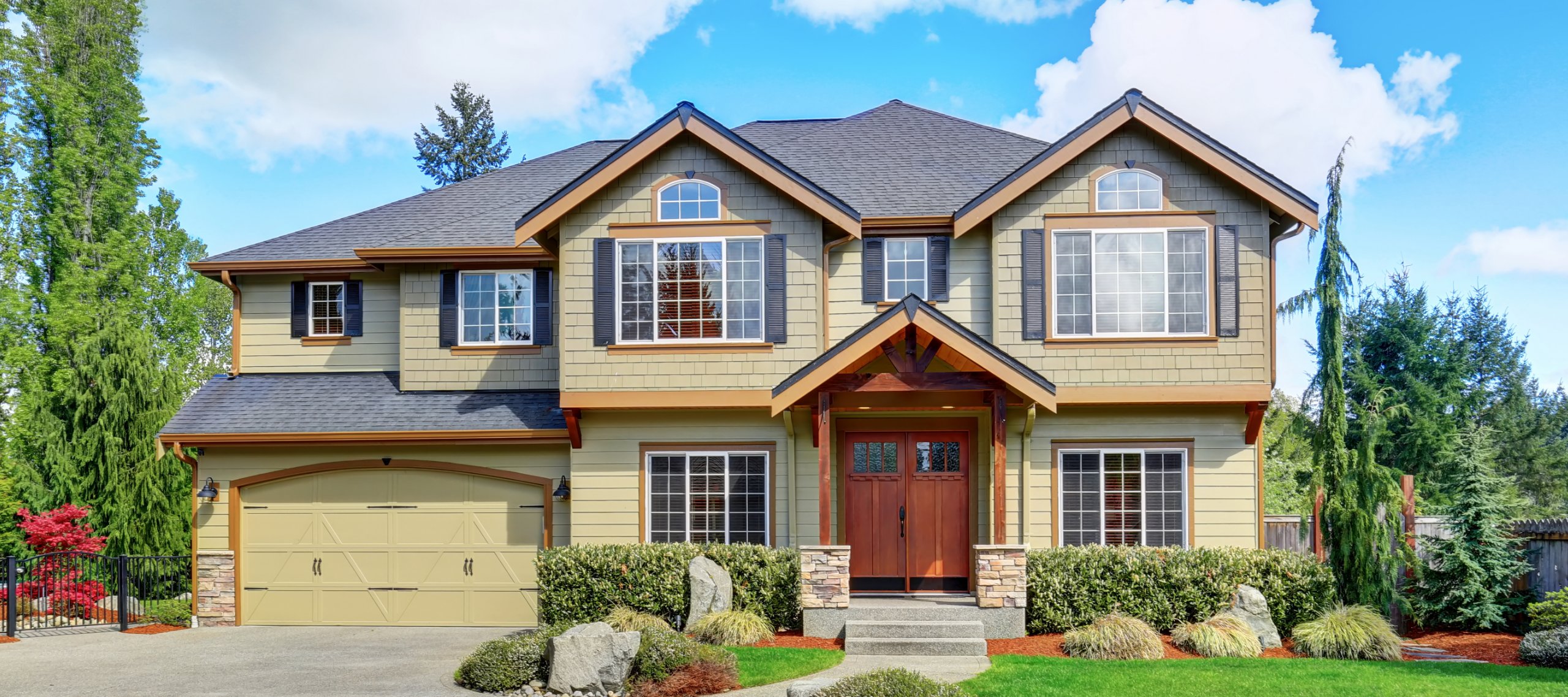
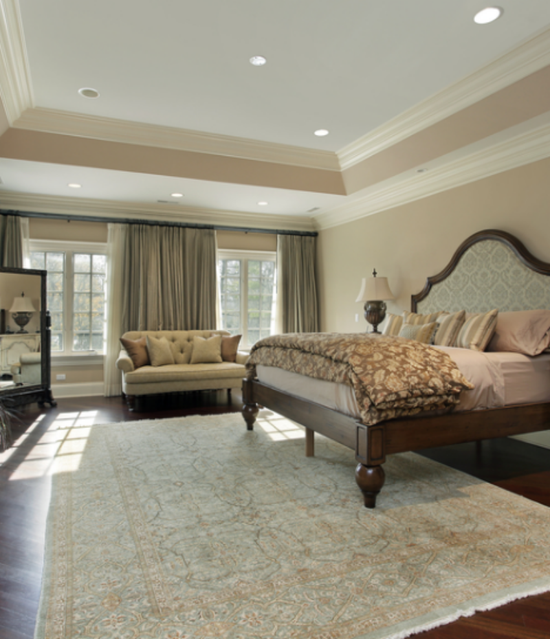
We are Virginia’s painting experts. With almost three decades in the business, our professional painters have worked on more than 10,000 homes. Whether you’re looking to refresh the interior of your home or business or enhance its curb appeal, we have the expertise to get the job done right. From prep work to painting to cleaning up, we take care of every step of the process, ensuring a stress-free project.
When you work with Medias Painting for your painting project — whether it’s interior or exterior, residential or commercial — you can be sure that the end result will exceed your expectations.
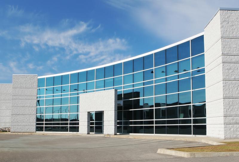
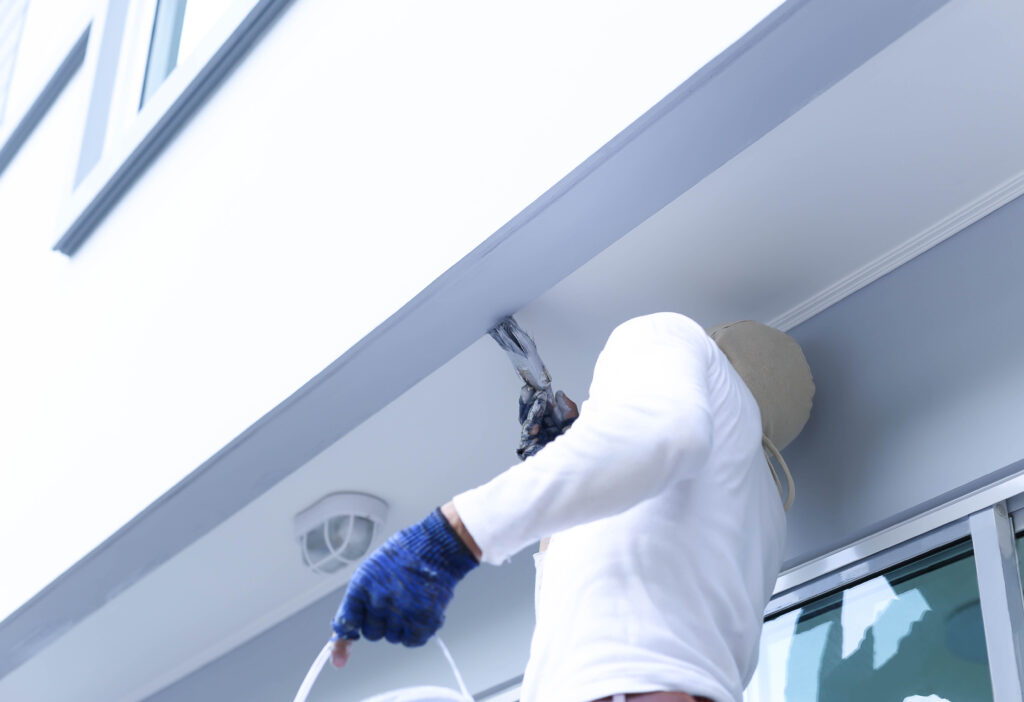
COMMERCIAL PAINTING
WE LOVE
Your building’s interior and exterior appearance makes a big difference in the way your business is perceived. A well-maintained, visually appealing building reflects well on your products or services and is essential to maintaining a professional reputation. At Medias Painting, we are committed to providing commercial painting services to businesses all throughout Virginia. Whether you own a retail store, warehouse, medical facility, or food service establishment, we have the expertise to help you bring your vision to life.
Trust the experts at Medias Painting for your next commercial painting project. Our highly trained team of professionals can transform your business into a more welcoming, attractive place.
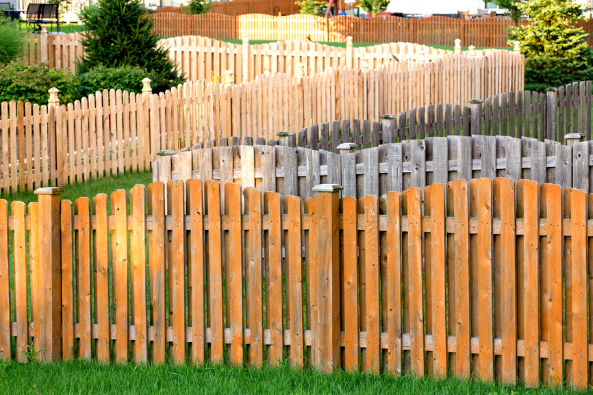
STAINING
WE LOVE
No other material can quite match the natural beauty of wood. To enhance and protect your wood fence, deck, siding, or other outdoor surface, take advantage of our professional staining services. With our expertise, we can get your wooden surfaces looking like new and protect them from future wear and tear.
The secret to our wood staining success lies in our careful preparation. Before staining, we thoroughly pressure clean the area to remove built-up dirt and debris. We also perform any necessary repairs on the wood’s surface. This attention to detail ensures a smooth finish and creates a durable, long-lasting result.
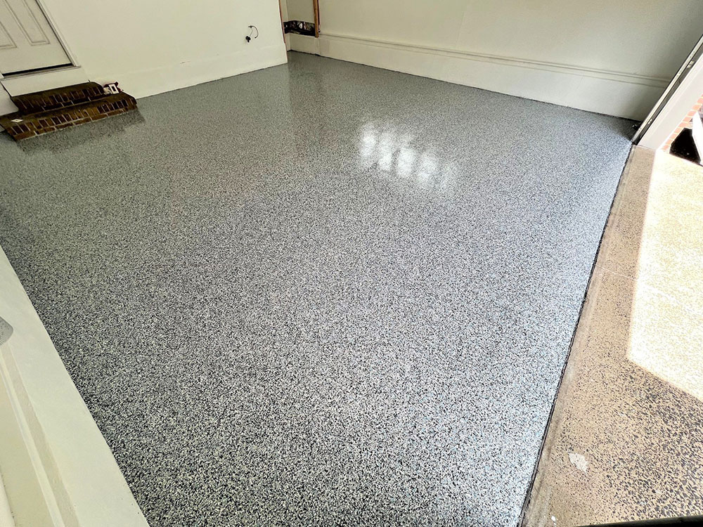
EPOXY FLOORS
WE LOVE
If you’re tired of the endless struggle to keep your garage floor clean, we have the solution you’ve been looking for. Epoxy garage floor coatings are a great choice for any homeowner. Not only do they make it easier to maintain your concrete floors, but they can also significantly enhance the appearance of your garage or basement, making it a place you want to spend time in.
We utilize high-quality epoxy, which is a specialized blend of resin and hardener. Our formula is fully customizable, so you can choose from a wide array of colors and combinations to create the perfect style for your home or business.
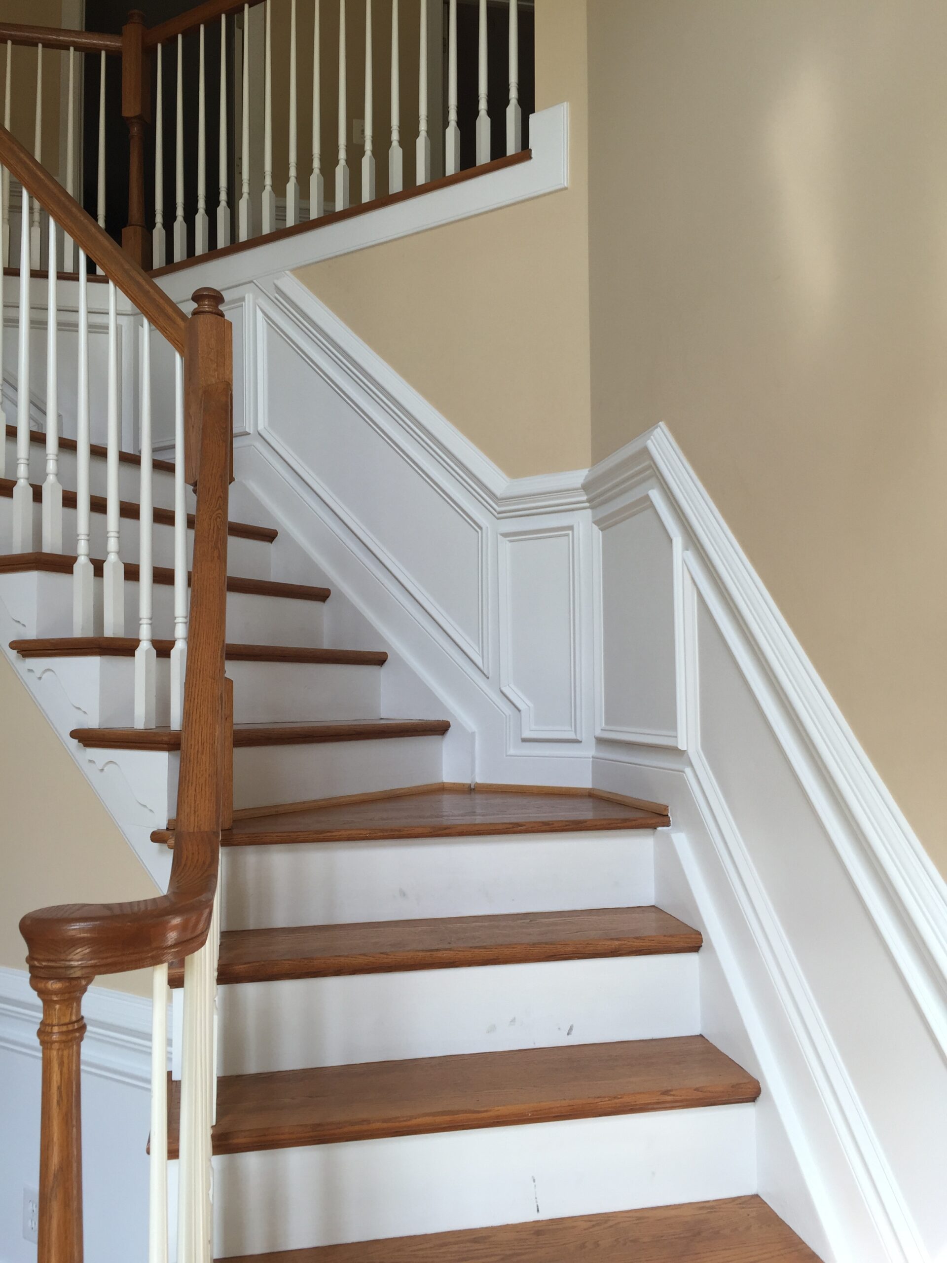
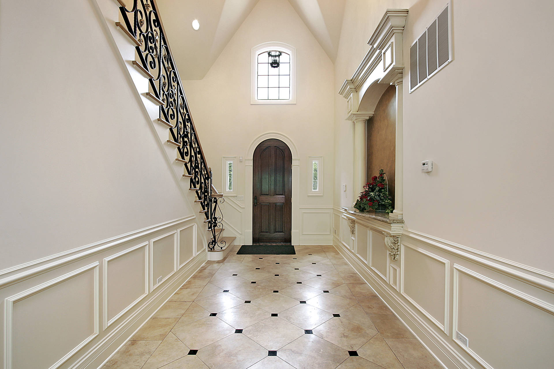
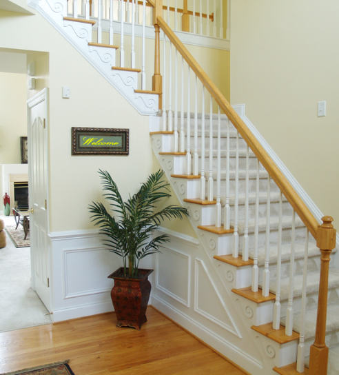
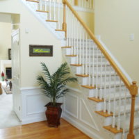
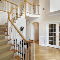
CARPENTRY
WE LOVE
Our expertise extends to the world of carpentry, as well. Custom wood architectural details, both interior and exterior, are a surefire way to elevate your home. Whether you’re looking for baseboards, crown molding, flooring, railings, decks, archways, box beams, or other custom solutions, our expert carpenters can create the perfect details to enhance your space.
What sets us apart from other carpenters is our attention to detail. We treat every project as a masterpiece in the making, so regardless of your personal style preferences, you can be sure that the end result will meet your expectations.
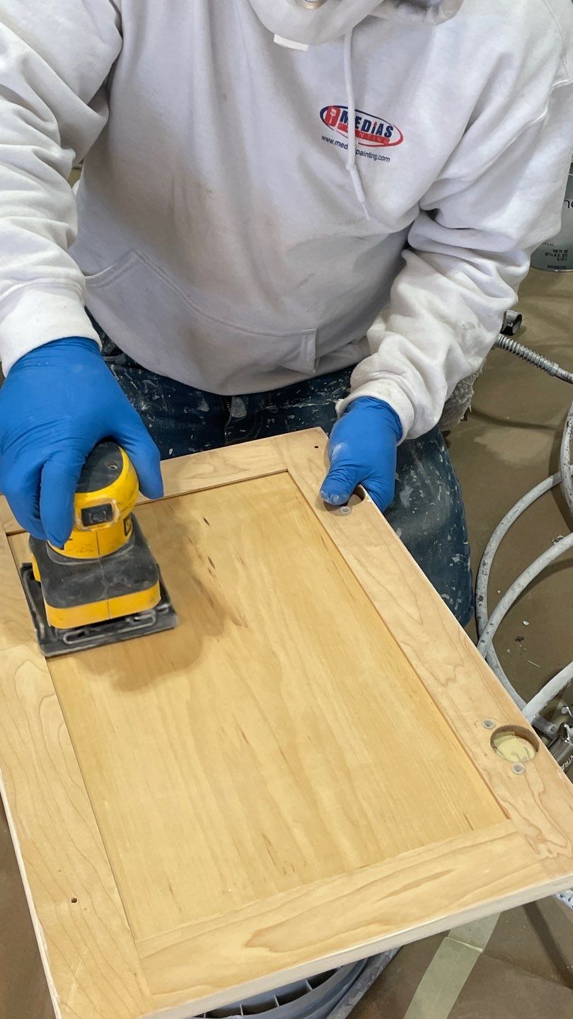
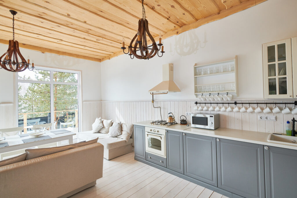
CABINET PAINTING
WE LOVE
If you’re looking to transform your kitchen, bathroom, office, or laundry room, look no further than our professional cabinet painting services. With our decades of experience and specialized skills, we can revive your old, worn-out cabinets and help you create a more inviting, functional space.
Whether you want to restore your cabinets’ original appearance or create a whole new look, our efficient process ensures you can create the aesthetic of your dreams without the hassle and cost of a full renovation.
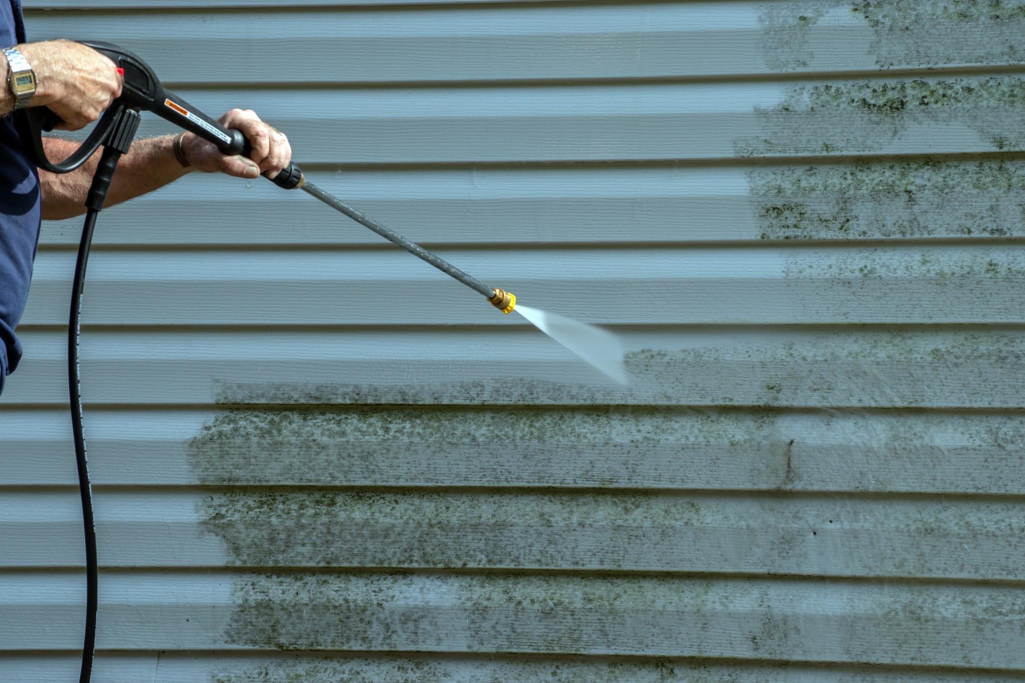
POWER WASHING
WE LOVE
Power washing is one of the quickest, most effective ways to improve your home’s curb appeal. Dirt and debris build up on your home over time, making it look drab and lifeless. It can be difficult to clean some of these outdoor surfaces on your own, which is where we come in. Our professional power washing services offer a convenient solution, making it easy to keep the outside of your home or business looking clean and well-maintained.
Whether you need power washing services for concrete, brick, stucco, vinyl, aluminum, wood, or another material, trust the professionals at Medias Painting.
ABOUT US
Choosing Medias Painting for your next project is a wise decision for any Virginia homeowner or business owner. Customer satisfaction is our number one priority in every job we undertake. Our attention to detail, including thorough surface preparation and cleaning, sets us apart from the competition. We provide transparent bids without any hidden costs and are known to meet our promised deadlines, so you know exactly what to expect every step of the way.
For all your painting needs, trust the experts at Medias Painting.
READ MORE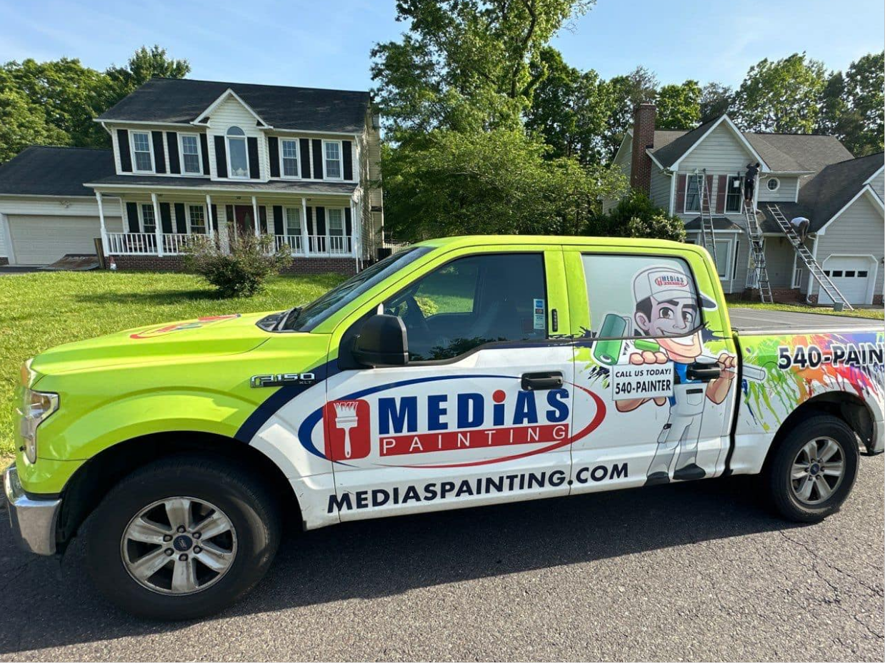
What makes us better
-

Products
- Better Looking
- Better Selection
- Right Product For Right Applications
-

Workmanship
- Attention to Detail
- Proven Methods
- Warranty
-

Core Values
- Integrity and Accountability
- Trustworthiness and Reliability
- Enthusiasm
-

Etiquette
- Communication
- Timeliness
- Cleanliness
-

Culture & Reputation
- Customer-Focused
- Valued Employees
- Financing

Testimonials
 Lea Braun2023-09-08Exceptional from start to finish! The entire process from the initial estimate to finished product was top notch. We could not be more pleased with Medias painting services. We will be using them for all of our future painting needs and additional services.
 Katie Palacios2023-08-21They gave my home LIFE! I had just recently moved in to my new home and it was dark and gloomy and medias took on this project and did an amazing job! From the girl at the office to the painters everyone was incredible! Definitely recommend this company for all of your painting needs.
 Ernesto Garduno2023-08-17Thanks again for a flawless transformation
 Ben Yoo2023-05-07Amazing guys did amazing work!
 Milos Draca2023-05-03Amazing service! Very professional went above and beyond to satisfy our needs. Definitely would recommend this business for any sort of painting.
 David Ryan2023-05-03Great job very professional on time very reasonable price - highly recommended
 David Eaton2023-04-29Outstanding workmanship and professionalism for the exterior and foundation painting of our house.
 Andrew Casperson2023-04-22I had a good experience. The job was completed within a week of receiving the estimate. I would highly recommend.
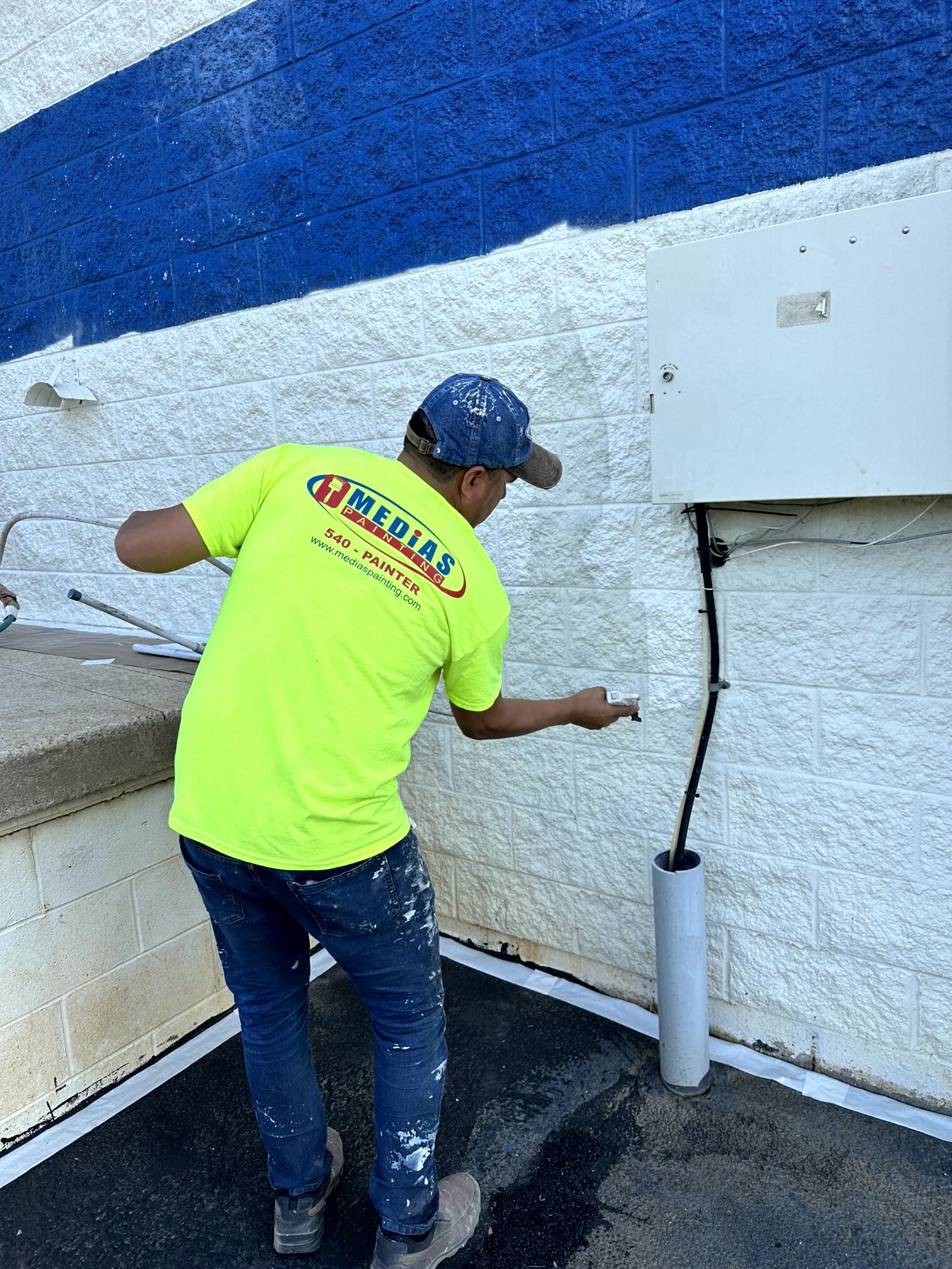
Recent Projects

Areas We Serve
- Fredericksburg
- Stafford
- Spotsylvania
- King George
- Prince William
- Caroline
- Louisa
- Woodbridge
- Triangle
- Lorton
- Dumfries
- Manassas
- Warenton
- Culpeper